December 28, 2016

Recognition

When making each of the quilts that developed into my series about loss, I worked from compelling needs of my own; I had little thought of an audience.  But as others have seen the work, I have found out that it speaks to other people as well, and that is gratifying too.  I've recently received two requests to show my work, one in a museum, the other in a book.  I am grateful for this recognition, and the chance it provides for more people to see two of my quilts.

The museum:  The Wisconsin Museum of Quilts and Fiber Arts asked me to contribute one or two quilts to their upcoming exhibit on the theme "In Death", which will be on exhibit from July through December, 2017.  They left the choice of work up to me. I'm probably going to submit "Self-Portrait, Year 2: Beneath the Surface" and "Holiness."

The book:  I was also invited to include "Self-Portrait, Year 2" in a book being put together by the Modern Quilt Guild, featuring about 200 "modern" quilts made in this century; the book is scheduled to come out in February, 2018.

Thanks to all of you who have helped me in the journey to make this work.

December 26, 2016

Further exploration of napkins printed with paper-laminated screens


I've also been working on the printed napkin project, started in the workshop I took with Claire Benn in October.  In the last week, I've made two more screens (bottom left and bottom right in the above photo), and I tried out six colors for the base fabric.  On all six, I used a dark value of Dharma's MX Indigo-colored dye when pulling the prints.  My thoughts on each of the above, with numbering starting with the upper left.
  1.  Lavender:  This screen was made by stamping with 2"acrylic squares.  I'm happy with the color.  I also like the design, though I've just made another screen with the same size squares, hoping that I get a better application of the matte medium that I stamp with.  I'd like to have more lavender showing after the print.
  2. Chartreuse: For this one, I cut out bowl-shaped stamps from sheets of foam, and stamped the screen.  I'm happy with both the color and the design.
  3. Teal:  For this one, I drew on the screen columns of interlaced squares, a pattern I have used in quilting.  See the photo below for an example where I used very fine black thread for the design.  But when I "drew" with a squeeze bottle filled with liquid matte medium, the result was very different.  Once I got over disappointment about how messy it was, I have to admit that I like the randomness of it.  
  4. Interlaced squares, quilted with Invisafil thread.

  5. Rust: The color is OK, but the design (another adaptation of a quilting design) is awful!
  6. Light blue: This design was made by stamping with 3" acrylic squares.  Opposite problem from #1--too much medium transferred to the screen, so not enough dark Indigo got through the screen.
  7. Coral: This was an attempt to use one of my line drawings of clover, also done successfully as a quilting design.  Again, the matte medium applies much more loosely, and this ends up looking like a bunch of spiders instead of flowers.  I do like the color, though.
Here are the drawn and stitched versions of clover, so much nicer than what I did on the screen:

drawing of clover, 2012

      stitching of clover, 2016
THE DESIGNS: I am aiming to get at least four screens that I'm satisfied with.  I could give up on drawing on the screen, but I'm not ready to yet.  I've drawn on another screen, using a much narrower opening in the needle-nose bottle that I'm drawing with. That one is another re-purposed quilting design, but plan to try a couple more that are more gestural, taking advantage of the looseness of the medium rather than fighting it.

THE COLORS:  I wanted to have six colors that worked together, but I think I may go with just four.  It is much more difficult than I anticipated to pick an array of colors that work with each other as well as with the dark indigo.  I am also thinking of another color array of neutral tans and/or grays that I would print with black.  In the two photos below, just think color; I won't continue re-use the "clover" screen on the coral cloth.


WHAT MAKES A SET?  I have been trying out colors and designs at the same time, but it may be that a set would be more pleasing if it was one color in four designs, or four colors in one design.  Here are two pieces from October, just blue and the cream color of the muslin cloth I'm using as the base fabric. These are unified by the blue/cream color scheme, and also by the commonality of a stamped image to make the screen.


So many choices. . .  Your thoughts most welcome!

Hamsa embroidery


I've also been doing some embroidery.  It started back in the spring of 2014, when I began doing a variety of embroidery stitches on my "Plain Spoken" quilt.  I eventually ripped out all that embroidery on that quilt because I didn't like the look of the varying stitches on this quilt.  But I did like doing the embroidery.  I used some of the stitches for borders on hand-dyed napkins.


And I've also used them on a series of embroidered hamsa gifts.  A hamsa is protective/good luck amulet, common to Middle Eastern cultures.  I made two for friends in cancer treatment.  The first was incorporated as a block into a quilt made by friends.  The second hangs from a loop of thread.


This fall, I made four more as gifts for several adults in my congregation who I tutored for their collective b'nai mitzvah ceremony this November.  This first of these I did in a class with Laura Wasalowski, fusing pieces of my hand-dyed fabric.

I liked the look of the applique, which gave a multi-color base on which to embroider, but I didn't like stitching the embroidery through two or three layers of fused cloth--very difficult to get the needle through.  So, I did the three others with needle-turn applique, no fusing.


Before changing to applique, I had stitched a blue outline on some violet cloth.  So I've continued stitching that one.


Difficult to see, but I used shiny gold thread for some of the stitching in the outer fingers.  Looks nice in person!
Before making the recent series of hamsot (Hebrew plural of hamsa), I tried out a variety of stitches that I could use as a reference for myself as I chose stitches.  After checking out several embroidery books from the library, I bought one that had clear instructions and a large number of stitches, the Reader's Digest Complete Guide to Embroidery Stitches.  The page numbers noted on my sampler reference that book.  I haven't yet made it through the whole book, but stopped when I had plenty to use on the hamsa project.


December 24, 2016

"Confetti"--a wedding quilt


It has been many months since I've made a quilt.  I finished piecing "Holiness" in March, 2016, and then worked on a couple of other pieces about stones until deciding in June that the series was complete with Holiness.  The next couple of months were spent preparing for my August exhibition (with a side-trip to a workshop with Paula Kovarik).  I spent September preparing for a print-making workshop with Clare Benn in October.  For a few weeks after the workshop, I did follow-up work from that, lining up elements of the cloth napkins I'd like to be making.  But I really missed sewing, so I interrupted the napkin-making to come back to a quilt I had started in the spring, a wedding gift for friends.  The inspiration for this quilt was one by Cecilia Koppman:

La Torre de Babel (The Tower of Babel) by Cecilia Koppman
I liked the neutral background and the splashes of color.  I saw a photo first, and only later the title of the quilt.  Not so appropriate for a wedding image. . .  I focused my design on the idea of confetti instead, which meant that the bits of color were all angular bits, no bars.  I changed the background to beige/tan, because that worked well in my friends' living room.  And though I wasn't sure if an image of throwing confetti would be denser at the top or the bottom, I've ended up with the dense part at the top.

Below is a photo of the work in progress.  I improvised blocks in various sizes, and then added and combined until I got a block that was 10.5" high, with varying widths.  I played around with placement of the blocks, ending up with seven rows.  As always with improvisation, the early steps were playful fun, and the latter part--when one has to move from randomness to considered composition--an interesting challenge.


For the quilting, I decided to use some of what I had learned in my summer workshop with Paula Kovarik.  I gathered a set of quilting designs that would be in keeping with a theme of celebration.  I included some floral designs that are a reminder of the tissue-paper flowers that the bride taught me to make, and that I contributed to the wedding reception.  I used the shapes of fabric pieces as a guide to where to change designs, though I sometimes crossed borders between shapes. (You can double-click on photos to get a larger image.)


For the back of the quilt, I did a much simpler design, making four large "court-house steps" log-cabin blocks.  I was able to use up most of the background fabric I'd purchased, including some darker pieces that didn't make it into the front.  The back took me 2 days to piece, the front more like a couple of months.  


When making the binding, I included a few bits of "confetti."  Go back to the first photo to see how they look on the front (where they fit in better with the design).

Update, 12/26/16:  I was very interested to see the comments on this post.  Both Brenda Gael Smith and Beth Berman make a point about how the back conveys a different feeling from the front, Brenda commenting on the restfulness of perpendicular lines and Beth on the feeling of order and stability.  I didn't do this intentionally (I was just going for something that would relate to the front but be much simpler to piece), but I love it that this wedding gift ends up speaking to two different sides of marriage:  excitement and improvisation/spontaneity on one side, and peace/security/stability on the other side.  If there were a way to design the batting inside the quilt--unseen but also key to the structure of a quilt--perhaps it could represent the painful conflict that disrupts any marriage from time to time.

November 24, 2016

Four days in New York

Central Park on a beautiful fall day

My husband and I spent four days in New York City last week.  We timed the visit around the Agnes Martin exhibit at the Guggenheim, and the show was definitely worth the visit.  It's difficult to convey the impact of her work in photos, as almost all of it is very quiet.  Her work looks minimalist, but is at heart abstract expressionist.  If you can be in New York before it closes (January 11), do go.

We filled our days with museums, walks in Central Park, music, good food, and time with friends--a lovely visit.  Here are the exhibits I went to:

Carmen Herrera at the Whitney (through January 2).  


Carmen Herrera is not someone whose work I knew about.  I love her work, which has much in common with Ellsworth Kelly.  You can read an analysis of why her work is not better known in this NYTimes article.  Herrera is now 101 years old, and still working.

Paths to the Absolute: Kandinsky, Malevich, Mondrian, Newman, Pollock, Rothko and Still, at the Di Donna Gallery (through December 3).  An exhibit of 13 paintings, on the occasion of the opening of a new gallery space.

Zao Wou-Ki (1920-2013) at the Asia Society, through January 8.  Zao Wou-Ki was born and trained in China, and then moved to Paris.  To my eye, his landscape paintings are a stunning blend of traditional Chinese painting, J.M.W. Turner, and abstract expressionism.  Here's a google image search of his paintings.

Three exhibitions at the Morgan Library:
Hans Memling: Portraiture, Piety and a Reunited Altarpiece
Word and Image: Martin Luther's Reformation
Dubuffet Drawings, 1935-1962 (through January 2).  This exhibit was a revelation to me.  I'm not particularly fond of Dubuffet's paintings, but was drawn to many of his drawings.

Dubuffet, Table Laden with Objects, 1951

Dubuffet, Landscape with Figure, 1960

Landscape with figure, detail


Jerusalem 1000-1400: Every People Under Heaven at the Metropolitan, through January 9.  Very interesting exhibit with a combination of material artifacts and manuscripts--in many different languages.  Includes a letter and a book manuscript in Maimonides own hand.

Kerry James Marshall, Mastry, at the Met Breuer, through January 29.  Striking work by a contemporary African-American artist.

Paul Klee (the Berggruen Collection), at the Met Breuer, through January 8.  I went to the Met Breuer for the Kerry James Marshall exhibit, and noticed they had a large exhibit of works by Klee as well, great bonus!

"The First Jewish Americans" at the New York Historical Society, through February 26

And a couple of very nice, reasonably priced restaurants:
Le Petit Poulet, 52 W. 33rd St. (between 5th and Broadway)
Il Violino, 180 Columbus Avenue (near 68th St.) (near Lincoln Center)

New York is a great place to visit!

View from the top floor of the Whitney Musuem


November 14, 2016

Post-election silence


I find that I can't post about my work in progress as though nothing else is going on in the world. Since I like to keep this blog focused on my studio work, I've posted my thoughts about the election on Facebook instead.  If you'd like to read the post, you'll find it here.  

I am hoping that writing these thoughts out will clear space in my mind for other things. . .

Penny

October 24, 2016

Folding and dyeing


While I continue to develop screens for printing designs on napkins, I thought I'd also try some folding techniques, while I also tried out a few more colors.  In these seven napkins, each fabric square was dyed one color, low water immersion, and washed out.  Then I soda-soaked again, folded in various patterns, and overdyed with a 3% solution of Dharma's MX Indigo dye.  Depending on the base color, the dark blue Indigo overdye either stayed dark blue (over light blue and lavender) or changed as it merged with the base color (most noticeable on the rust colored fabric, where the orange and blue together turned the darker color to more of a brown).  Here's a record of the folds, starting at the top and going left to right for each row:

  1. Light blue base:  a diagonal accordion fold, with dark blue applied in horizontal bands.
  2. Gray base: diagonal accordion fold
  3. Pumpkin base: folded in half to make a triangle, then accordion folded perpendicular to base of triangle.
  4. Tan base: One corner secured with a clothespin, holding on to the opposite corner, I twisted the fabric like a rope.
  5. Green base:  folded vertically, and then a flag fold.
  6. Rust base: folded vertically, then folded horizontally into small squares.
  7. Lavender base:  This one not folded, but simply scrunced into a tight "hockey puck" in the base of a small plastic container and the dye poured on both sides.
My goal is to have designs that look appealing when the napkin is folded, as well as when it's open.  Getting the design to look good on the folded napkin is the more challenging of the two.  I think all of these work OK, with my favorites probably #1, 4, and 6.  I like #3 better in the folded state than unfolded.  Your opinion most welcome!


October 14, 2016

"Lines and Rows" workshop with Claire Benn


Last month I wrote about my preparation for a workshop with Claire Benn, working up designs for hand-printed napkins.  Once at the workshop, my direction changed from clean-line designs to something else.  The two above are my favorites, both done by stamping with matte medium to make a paper-laminated screen.  The one on the left used a 3" square of acrylic, the one on the right, a variety of stamps I made in a bowl shape.  The virtue of the paper laminated screen is that it can be made any size (here I'm aiming for an image 18x18), and can be re-used many times.  I've worked with a "paplam" screen once before, a very large one made for Accident II.  In that case, I wrote on words with the matte medium.  So, in addition to stamping, I can also try drawing some designs onto the screen.

Below are two more pieces made with the bowl stamps, the first stamping directly with dark blue dye onto lighter blue cloth.


In the one below, I stamped with discharge paste onto the blue cloth, and then later stamped again with dark blue dye.  I like these also, but I'll probably explore doing more designs with a screen, since I can do the whole napkin in one pass, rather than hand-stamping each unit of the design.


 And here's one I did from a thermofax screen, based on a hand-drawn design.  The thermofax is limited to about 8" across, so I needed to print three times to get across the 18" field.  I think I'll try another version of this design on a paper laminated screen.  It turns out that for this project, I like the imprecision of the paper laminated screen rather than the precise reproduction one gets with a thermofax print.


I'm pleased with the new direction, and will continue to work on more designs, as well as variations of the ones I came up with at the workshop.  

October 13, 2016

Exhibition web site now up!


Finally, the web site is up.  I've been waiting for the video of David's recital at the opening.  Everything is now there, including photos and commentary on each of the quilts and the text of my short gallery talk, which focuses on the character of abstract art.

September 27, 2016

Workshop with Paula Kovarik


This summer, I had the good fortune to take a week-long workshop with Paula Kovarik at Arrowmont School of Arts and Crafts.  The workshop was called "Follow the Thread," and was aimed at teaching a process of generating quilting lines that are not just the standard repetitions, but that originate from an idea or inspiration, with the line developing from there, and then changing as the thread leads one on.  I deeply admire Paula's work, and leapt at the chance to do a workshop with her.  (You can see other posts of mine about Paula's work here.) Paula's own work is often "whole cloth"--that is, the cloth is one piece of fabric or simply pieced, and the focus of the work is in the stitching. I don't imagine myself ever doing whole-cloth pieces, but was confident I could still learn a lot from Paula. I had two goals for the workshop.  The first was simply to further develop my skills and confidence in machine quilting.  This is the aspect of quilting that I feel the least comfortable with.  I'd like to do it more confidently, and would like to build it more into the overall design of a work.  And I'd like to enjoy it more!  The second goal was to work further with floral motifs based on the line drawings I began doing a few years ago.  I wanted to work on simplifying the drawings further so that I could use them in repeated designs.  I had been thinking of using the designs as motifs in printing fabric, but I thought it wouldn't hurt to try them out as stitching designs along the way.  I made a great deal of progress towards both goals during the week, inspired not only by Paula, but by the awesome work of other students in the workshop.

The photo at the top is probably my favorite piece from the workshop, stitching based on a drawing of perennial salvia.  You can see the whole thing (about 15" square) in the bottom left below, along with other exercises.  (Double-click to enlarge.)


Here's another sample where three of the designs are worked off a drawing of a branch of ash leaves.  The upper right corner is a trial of the variegated black-to-white thread that Paula had us try.  It provides an easy way to build in serendipity, as the white disappears if sewing on white fabric, or the black if sewing on black (as in the set just below the white sampler).


And a final example, with the panel on the right a riff on early drawings of clover, a couple of other permutations of the ash leaves, and some simple squiggles just for fun.


I expect to spend some time developing one or more of these motifs in my workshop next week with Claire Benn.  But if they don't find a home on printed fabric, I may well incorporate them into some quilting. . .


September 23, 2016

A new project


I will be taking a week-long workshop with Claire Benn in early October on "Lines and Rows: Rhythm and Repetition."  Claire describes the aim of the workshop:  "to focus in on the power of the repetitive mark, building lines and rows to create cloth that has rhythm and simplicity."  This will be a chance to followup on work I did with Claire in 2014 (which led to my Accident II quilt) and also work I did with Dorothy Caldwell in 2013.  Claire asked participants to prepare ahead in various ways, including laying out 100 of the same thing in lines or a grid, looking for pattern everywhere, and narrowing one's focus to a small number of types of marks/shapes of interest.  I've spent the last few weeks, since the close of my show, working on this, and look forward to developing ideas further at the workshop.  I have a humble goal in mind, which is to make fabric that I can then turn into table napkins.  I've long made napkins for our own use at home, and also as gifts for others, but have made them from commercial fabrics. A few years ago, I made some from Marcia Derse's beautiful fabric, which is commercially produced but based on her hand-dyed/painted fabric.  I have been wanting to come up with some designs that would work for making my own fabric, and Claire's workshop gives me that opportunity.

I made the design at the top by cutting up black construction paper.  The idea for the design came from a drawing by Karl Benjamin:


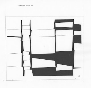
I am entranced by this drawing--something very appealing to me about the piled up block shapes.  I pulled out one column of the blocks, changed them from white to black, and increased the space between the blocks.  Multiplying the columns, changing the order in some columns:

This is still very close to the Benjamin drawing--too close for me to feel comfortable using it--so I decided to try the same idea with triangles, and came up with the design at the top of the post, which I will enjoy playing with more.  I'll also do some trials with wedge-shapes.  Here's a postcard I made some years ago, but never sent because I like it too much: 


I got another interesting shape by manipulating a photograph in Photoshop.  Here's the photo, which was a collection of 100 blossoms from a chestnut tree:


Through cropping and various manipulations, I came up with this:

I collected 100 examples of several things, but my favorite was pine needles.  Here are a few different arrangements of 100 needles.  So much potential here for beautiful line drawings!  Another option is to turn one or more of the photos into a thermofax screen, which could be used directly for printing.  (You can double-click on photos to see them larger.)


Another direction is to work from the lovely lines of the piece below, made by free-motion stitching with a variegated thread that changed in color from black to white--hence the "missing" spaces in the design.  This was a sample I did in a workshop with Paula Kovarik in early August. Which reminds me that I'm long overdue on a post about that workshop!  As soon as I got home from that, I had to set to work setting up my show, and forgot to get back to it.


And some other line drawings of elements that interest me.  

Stylized from a drawing of clover I did some years ago

I like drawing cups, which make me think of friends talking over cups of tea.


Drawn recently at a local park.  The top one was a line of very fuzzy strand-like blossoms on a branch.

And these are designs I sometimes use in quilting.  The second one from the right (squares) particularly interests me.


So, I think I'll have plenty to work with at the workshop. . .  

I will eventually be working in color rather than black and white.  Here are some sample colors I dyed up last week: