About a year ago, Abby Glassenberg wrote an article for Generation Q magazine about my quilt "Self-Portrait, Year 2: Beneath the Surface." She recently re-published the article on her blog, which makes it accessible to people who didn't see it in the magazine. Thanks Abby! Here's the link. There are already some thoughtful comments after the body of her post.
One bit of further explanation about the last paragraph of the article, which has me posing the question "Am I a mother with [my son] gone?" It was actually online commenters who raised the question, and Abby wanted to know my response. The text on the Self-Portrait quilt states, "I AM A WOMAN WHOSE CHILD IS DEAD." Among the many online comments I received about the quilt was one thread that said something like: "Why did you say 'woman' instead of 'mother'? You're still a mother!" I think people felt I was being too hard on myself--that I shouldn't deprive myself of this cherished title, and that I would somehow always be a mother. But the fact is this: I was once a mother, a role that was very important to me. But with my only child dead, I am no longer a mother. When deciding on the text of the quilt, I didn't consciously make a choice between "woman" and "mother"; it simply didn't occur to me to write the word "mother." Being a mother has certainly had a lasting impact on me, and I have continued to use what I learned in my eighteen years as a mother--with my students, when I was still teaching; with other children I interact with. But that's very different from being a mother. I am grateful I had that opportunity in my life, I am grateful that Jeremy was the child in my life, and, now that loss has replaced motherhood as a central experience, I do my best to continue a life that sustains caring relationships with others, even while they are very different from that between a mother and her child.
May 12, 2016
Change of direction
Back in early March, I started working on a final quilt in my series about loss, one that would focus on stones, and would include some kind of imagery of stones; see this post on the design, and then two more posts on dyeing, discharge, and stitching trials for the stones, here and here. Then I had a chance to get some productive critique of the work when meeting with quilting friends in Chicago, and the work has gone through significant change since then. I realized that I wasn't really interested in the kind of rectangular patchwork background that I had been working on, but rather on the stones themselves--they needed to be the central focus. When something isn't working, it's a relief to figure out what's wrong! Here's where my thoughts have been going since. . .
About ten years ago, I made a small piece, with the light gray area the size and shape of the headstone on my son's grave. The idea behind the piece had to do with the Jewish practice of leaving a stone on the headstone of a loved one when visiting the grave. I thought I would quilt stones into the narrow, dark gray band.

Around the time I was working on this piece (2007), my friend Mary Beth came for a visit to Galesburg, and we went out to the cemetery. Mary Beth did a couple of small, rough sketches, thinking about adding in stones, and maybe cropping the composition.

I was moved by the drawings, but also was more drawn to abstraction. I thought that even quilting in stones would detract from the abstraction of the composition. Yet the piece felt incomplete without some gesture of stones, and I never proceeded further with it. It's been folded up and put away for a long time.
But now, having finished the piece on "Holiness," in which I aimed to capture something of the essense/nature of the stones placed on graves, I realize that I want to confront the stones "face to face." In "Holiness," I worked with color. For the final piece, I will come back to shape. I took out the small gray/blue piece and decided the first thing to do would be to increase the size, and to also draw stones placed on top of the grave, so going back to Mary Beth's drawings. I knew the stones would need to be larger than the small ones I actually put on the grave, but I wanted to keep them about the size one could still hold in one's hand--somehow that seemed important to me. So, starting with stones that size, the whole composition ended up about 36 x 60. Here's the sketch on newsprint:
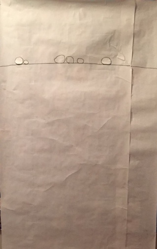
But even though this is about twice as large as the gray/blue piece, it still seemed too small to me. I made a leap and started sketching larger stones.

Finally, I drew with the sweep of my arm, rather than my hand. I'm down to two stones; each of these is about 36" wide. It feels like I'm going in the right direction. I like the idea of limiting it to just two stones, with the suggestion of more of the headstone to the right and below. (There will be more space at the bottom--I'm not sure how much.) It feels like David and me, visiting Jeremy's grave.

Next steps:
- work further on the shapes of the stones
- do stitching trials for the stones--I'm thinking these will be "drawn" with a single line of stitches. But I could switch gears and do these as large appliquéd shapes.
- decide whether the top of the headstone will be indicated by a seamline between two slightly different colored fabrics (a light and light-medium gray), or whether it will just be a stitched line
- decide on fabric (I've dyed light gray samples of a number of different fabrics; I'm thinking of using linen, either for the whole thing, or for the bottom piece if seamed.)
And some influences: the work of Karine Léger (so beautiful) and this by Ellsworth Kelly.
Subscribe to:
Posts (Atom)
